Laney Ruehmann
PROJECTS
Map | 01
Map | 01
South America Reference Map
The purpose of this map was to work on applying the five essentials of map design to create a reference map that was legible and clear to read. While creating this map, methods including figure-ground, legibility, clarity, balance, and visual hierarchy were needed to make a coherent map. The major challenge that came with creating this map was trying to find compatible colors that worked with not only the map but with the other fonts present on the map as well as label placement.


Map | 03
Map | 03
Lake Pend Oreille Bathymetry
The purpose of creating this map was to practice using the the five essentials of map design. The information being displayed within this map is the bathymetric lines of Lake Pend Oreille in the northern part of the panhandle of Idaho. Bathymetric lines demonstrate the depth and the grade of a lake. The lighter colors show the shallow parts of the lake and it progressively gets darker to demonstrate the deeper depths. The main challenge that came with this map was simply making enough time to completely digitized the bathymetric lines.
Map | 04
Map | 04
Varying Map Projections of Wisconsin
The purpose of this map infographic of Wisconsin was to apply an understanding and knowledge of coordinate systems and projections. This was done through demonstrating nine different projections applied to Wisconsin and explaining what factors will change and distort the state.


Map | 05
Map | 05
GPS Map of Owl Head Trail in Merrick State Park
For this map, I had to use GPS to map out a track at a location. For my location, I chose to go to Merrick State Park, WI. The Owl Head Hiking Trail has recently implemented informational signs around the .6 mile trail. This map was created with GaiaGPS and transferred into ArcGIS Pro to add map elements and to include information sign labels and their order. This map provided a challenge in reacquainting myself in using ArcGIS Pro again.
Map | 06
Map | 06
Number of Farms by County in the US, 2012
This choropleth map demonstrates the number of farms by county using ArcGIS Pro and Census of Agriculture data. The dark green regions show where there are high numbers of farms and the numbers of farms in each county decrease with each lighter shade of green. One skill that I learned from working on this map is being able to understand what data is being presented and then being able to make connections to why certain trends may be occurring within this map.


Map | 07
Map | 07
Proportional Symbol map of Iceland Tourism
This proportional symbol map demonstrates numbers of tourists traveling to Iceland from other parts of the planet. For this specific map, the US ranked the highest and to demonstrate the difference in numbers from other countries, symbols were adjusted according to their percentage to the US. A challenge that this map presented was trying to determine how big or small the base symbol should be while making sure the other symbols would fit in their region.
Map | 08
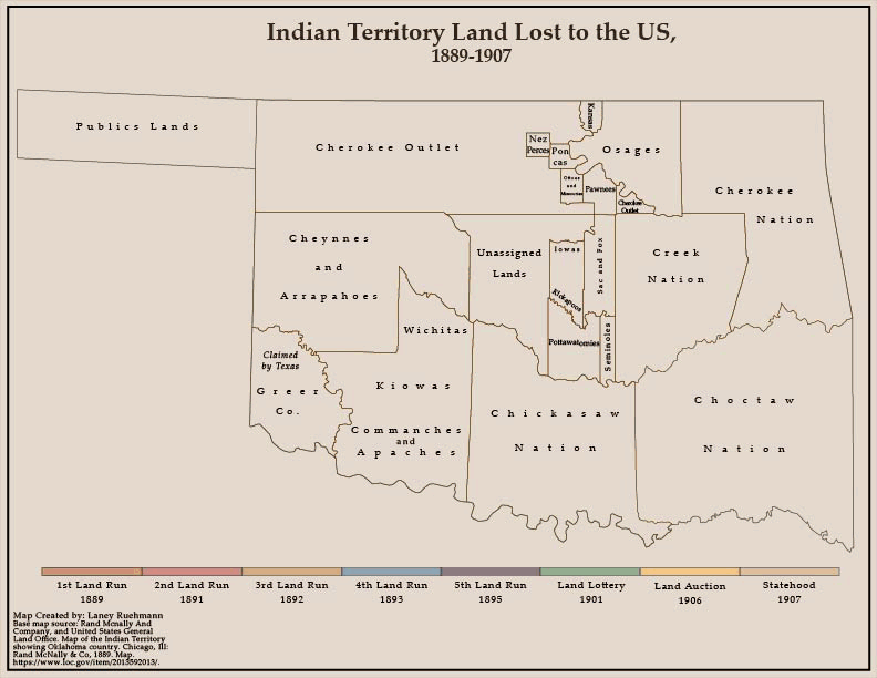
Map | 08
Indian Territory Land Lost to Oklahoma
Static Image and Animation
This map was designed to demonstrate the 18 year period in which Indian Territory land was taken and turned into Oklahoma. While using Adobe Illustrator, a General Land Office map of Indian Territory was used to create a base map and maps from a 1939 issue of The Daily Oklahoman were utilized to map out the land that was added to Oklahoma territory and during what year. This map allowed me to explore features within Adobe Illustrator that I had not yet needed to use as well as work with creating clear and pleasant color schemes.
The animation was created using several frames exported from the main map and pieced together in Photoshop to show a fluid progression of land loss. I also played around with Photoshop and was able to use the animation feature through self teaching.


Map | 09
Map | 09
3D Vintage Topographic Map of Chief Mountain, MT
This map was created with the help of a series of video tutorials done by John Nelson. This project was designed to make an old 1904 U.S.G.S. map of Chief Mountain in Montana look like its elevation is coming up from the base map. This map allowed for expanded practice with implementing multiple hillshades and allowed for plenty of creative liberty to get to exact look and style desired for the final product.
This map was designed by using several different layers of hillshade simulating different angles of the sun to simulate the topography lines coming up off the paper. This also was done by modifying the color scheme and adding mist and highlight effects.
John Nelson's Tutorial: How to make those cool 3D vintage topo maps in ArcGIS Pro (esri.com)
Map | 10
Map | 10
Hurricanes Since 1850 using Firefly Mapping in ArcGIS Pro
This map utilized the technique of firefly mapping using ArcGIS Pro. This was designed following the a tutorial done by John Nelson to help expand stylized techniques within GIS programs. Creating this map was excellent groundwork in expanding skillsets and techniques by making sleek and unique looking maps.
To make sure there was a little of creative liberty from the general tutorial, I added some stylized variance through the color scheme and the set up of the map elements. The color scheme was put together using ColorBrewer and implemented into ArcGIS Pro.
John Nelson's Tutorial: How to make this crazy map of hurricanes since 1851 (esri.com)
